Table of Contents
- Understanding Design Concepts and Visual Style for Uniforms
- Custom Uniform Logo File Requirements and Formats
- Artwork Resolution for Shirt Printing and Embroidery
- Custom Uniform Design Placement and Sizing
- Color Selection, Contrast, and Typography
- Uniform Design Proof Approval and Quality Checks
- Production-Ready File Checklist for How to Prepare Artwork for Custom Uniforms
- Frequently Asked Questions
Last Updated: October 10, 2026
Understanding Design Concepts and Visual Style for Uniforms
When you start the process of how to prepare artwork for custom uniforms, establish a clear design concept that answers three questions: What represents your team or brand? What feeling should the uniform convey? How will it look from a distance? A cohesive design concept ensures your logo, colors, typography, and placement all reinforce the same message.
Define your signature color palette with strong contrast. A navy logo on black disappears; a white logo on navy pops.
Sketch your design at actual size before committing to artwork files. This catches placement and proportion issues before they hit production. Most teams skip this, it saves weeks of revision cycles.
Custom Uniform Logo File Requirements and Formats
Your logo file is the most critical asset in how to prepare artwork for custom uniforms. The wrong format causes pixelated printing, blurry embroidery, or delays. Two file types matter: vector and raster.
Vector vs. Raster Files: Which Works Best
Vector files (Adobe Illustrator, EPS, SVG) scale infinitely without quality loss and are the gold standard for uniforms. Raster files (JPEG, PNG, BMP) are pixel-based and pixelate when enlarged, avoid them unless your design is already at final size. Vector ensures crisp edges at any scale.
Sending a low-resolution raster file to production is the #1 mistake we see. Your logo will look jagged on the finished uniform. Always convert artwork to vector or request a vector version from your designer before submitting.
File Format Standards for Production
EPS files are the industry standard and read natively by most equipment. AI files work well but may need conversion to EPS or PDF. PDF files are acceptable if vector-based, not scanned. SVG files work for digital printing but may need conversion for screen printing or embroidery. Always ask your vendor which format they prefer.
Artwork Resolution for Shirt Printing and Embroidery
Resolution requirements vary significantly by decoration method. Understanding these differences prevents artwork rejection at production and costly revisions.
Resolution and Technical Limits by Decoration Method
Screen printing requires 300 DPI at final size. Avoid gradients with more than 3-4 color transitions, keep lines no thinner than 0.5 points, and limit colors to 6 per location. Thin lines break apart; photorealistic images don’t work. Screen printing excels with bold, solid-color designs.
Embroidery uses stitch count, not DPI, and requires vector artwork. Fine detail (lines thinner than 1 point, text smaller than 0.5 inches) won’t digitize cleanly. Gradients are impossible; use color blocks. Maximum practical design area is 8 × 8 inches to avoid puckering.
Heat transfer vinyl (HTV) works with vector files at any resolution. Avoid fine detail thinner than 0.5 points and text below 0.25 inches. Use solid colors and simple color blocks.
Direct-to-film (DTF) and direct-to-garment (DTG) printing require 300 DPI and support photorealistic images and unlimited colors. DTF has a 17-inch width limit; DTG works best on light-colored garments.
Sublimation printing requires 300 DPI and works only on polyester or polyester-blend garments. It produces vibrant, full-color designs but cannot print white (the garment shows through). Plan artwork with this limitation in mind.
Common Resolution Mistakes and Fixes
Submitting 72 DPI artwork causes pixelation or jaggedness. Always request 300 DPI minimum or a vector version that scales without quality loss.
Using RGB instead of CMYK causes color shift. RGB displays with light; CMYK prints with ink. Convert artwork to CMYK before submitting.
Embedding raster images in vector files prints poorly. If your design includes photographs, embed at 300 DPI and ask your vendor which method works best (DTG or DTF; avoid screen printing).
Never assume one file works for all decoration methods. Screen printing and embroidery have different technical requirements. Always ask your vendor which format and resolution they need before finalizing artwork.
Custom Uniform Design Placement and Sizing
Placement and sizing are where theory meets production reality. Poor placement ruins an otherwise perfect design.
Placement Locations and Measurement Guidelines
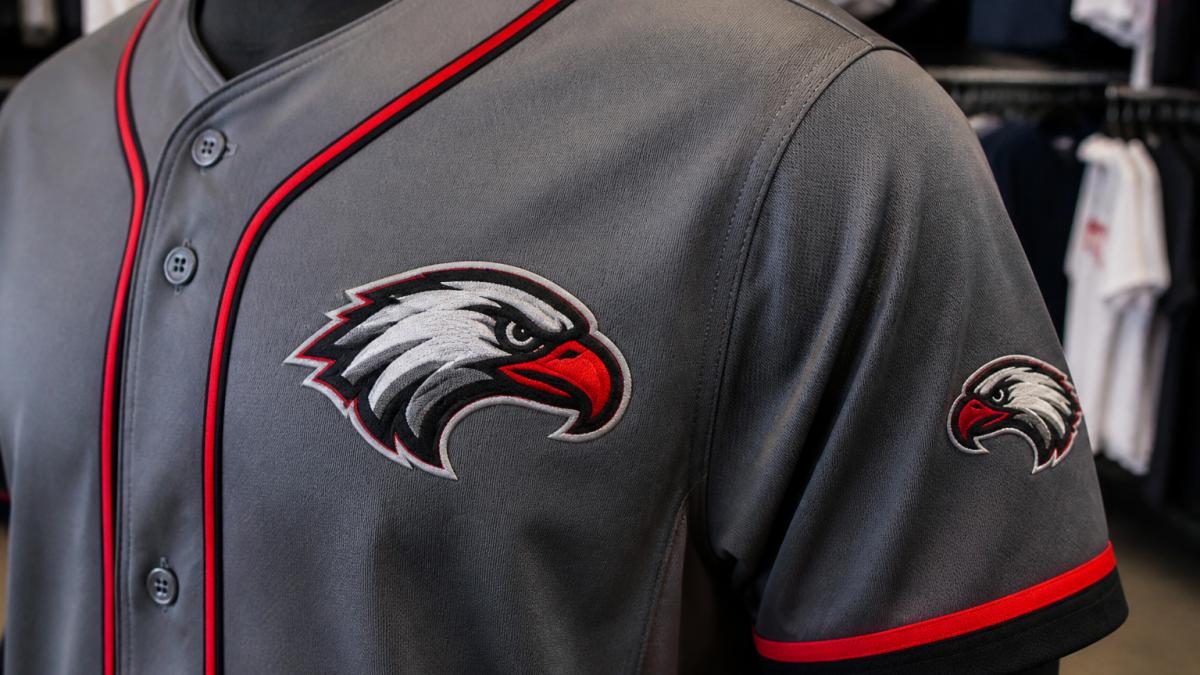
Standard placement: Chest 3-4 inches from shoulder seam (highest impact); Sleeve 2-3 inches below shoulder seam; Back neck 1-2 inches below collar; Pant leg 4-6 inches above hem. Always measure on an actual garment, logos centered on flat mockups can appear off-center on curved chests.
Sizing Artwork for Different Garment Types
Scale logos 20-30% smaller for youth sizes and slightly larger for XXL+. Artwork should occupy 15-25% of available garment space, smaller disappears, larger dominates.
Proportion matters more than absolute size. A 4-inch logo looks right on one garment and wrong on another based on the garment’s dimensions. Always test on the actual size jersey before production.
Color Selection, Contrast, and Typography
Color choices determine whether your uniform design succeeds or fails from across a field or gym.
Choosing Colors and Ensuring Visibility
Ensure high contrast, test colors in low light and bright sunlight. Avoid red-green combinations (indistinguishable to 8% of males) and navy-black pairs. Add white or light borders if needed. Always request color mockups on your chosen garment before production.
Font Selection and Text Preparation
Use sans-serif fonts (Arial, Helvetica, Futura) for legibility at distance. Avoid script and thin fonts, they break apart. Convert all fonts to outlines before submitting to prevent substitution errors.
Uniform Design Proof Approval and Quality Checks
Proofs are your final quality gate before production commits to your design. A structured approval process catches errors that cost thousands to fix after full production.
The Three-Stage Proof Workflow
Stage 1: Digital Proof (Color and Placement Approval)
Request a digital proof on your actual garment style, color, and size showing placement, text, color, and dimensions. Verify color accuracy against PMS swatches (screen colors appear brighter than prints), placement alignment with measurements, text legibility at arm’s length, and proportion on the curved garment. Request specific revisions in writing: “Move logo 0.5 inches lower” rather than vague feedback.
Stage 2: Physical Sample (Durability and Quality Check)
Stage 3: Pre-Production Sign-Off
Before your vendor begins full production, provide written approval that includes:
- Date of approval
- Names and signatures of all decision-makers (coach, team manager, brand representative)
- Specific approval of the physical sample as the production standard
- Confirmation of order quantity, garment sizes, and decoration locations
- Any special instructions (e.g., “All XXL jerseys use 5-inch logos; all youth mediums use 3-inch logos”)
This written record prevents disputes and ensures everyone agrees on what “finished” looks like.
Quality Checklist for Physical Samples
Use this checklist when evaluating a physical sample:
Common Proof Issues and How to Resolve Them
“The colors look different on the sample than on the digital proof.” This usually happens because digital displays use RGB (light-based) color while printing uses CMYK (ink-based) color. Solution: ask your vendor for a PMS (Pantone Matching System) color specification and request a physical swatch before approving the digital proof. PMS colors are industry-standard and reproducible across vendors.
Production-Ready File Checklist for How to Prepare Artwork for Custom Uniforms
Before submitting artwork, verify every item:
- File is vector format (EPS, AI, or PDF from vector source)
- Resolution is 300 DPI at final print size (for raster elements)
- All fonts are converted to outlines or paths
- Colors are specified in CMYK or PMS (not RGB)
- [ ]
- Artwork size matches final dimensions on garment
- Placement is marked with measurements from seams or reference points
- Artwork has been proofed on actual garment mockup
- File name is clear and version-controlled (e.g., Logo_v3_Final.eps)
- You have written approval from all decision-makers before submitting
This checklist prevents 90% of production delays and revisions.
Getting your artwork right the first time saves weeks and frustration. When you work with Piercy Sports and Apparel, our team reviews every file against these standards before production begins. We catch placement issues, resolution problems, and color mismatches before they reach the production floor. Our high-resolution digital printing and premium embroidery services mean your designs stay vibrant and durable through countless washes. Get started with Piercy Sports and Apparel and transform your vision into uniforms your team will be proud to wear.
Frequently Asked Questions
What file format should artwork be for custom uniforms?
Vector files like AI, EPS, and PDF are ideal for custom uniforms because they scale without quality loss. Submit files in the format your provider requests, most ask for vector files or high-resolution PDFs with fonts converted to outlines to ensure accurate reproduction across screen printing and embroidery.
What resolution should a logo be for uniform printing?
For artwork resolution for shirt printing, use at least 300 DPI (dots per inch) for print-ready files. Vector files don’t have a DPI requirement since they’re resolution-independent, but raster images must meet this standard to avoid blurring or pixelation.
How do I prepare artwork for embroidery on uniforms?
For embroidery, submit your artwork as a vector file (AI or EPS) or high-resolution raster image (300 DPI minimum). Your embroidery provider will convert your artwork to machine-readable stitch files, so provide clear, high-contrast designs with adequate spacing between elements for thread clarity.
Where should logos and names be placed on a uniform?
Standard custom uniform design placement includes logos on the chest, sleeves, or back. Names and numbers typically go on the back or sleeves. Check with your provider for specific measurements based on garment type, jersey placement differs from polo or jacket placement.