Last Updated: November 11, 2026
Quick Summary
The best color palettes for sports uniforms balance contrast, team identity, sport-specific visibility, and how colors reproduce on fabric. Proven combinations include navy and white with a gold accent, black and white with one bold accent, maroon and cream, royal blue and silver, and forest green with white and gold trim. Two strong colors plus one neutral beats four competing hues every time.
- Red reads as aggression, blue signals calm and control, and green suggests growth and steadiness.
- Football jerseys need maximum separation between jersey body, numbers, and pants for broadcast readability.
- Print a small mockup, tape it to a wall, and step back twenty feet to test number readability.
- Use a sports color palette generator for brainstorming, but never let it make the final call.
- Approve a physical swatch before ordering, because dye lots, fabric finish, and print method shift final color.
Table of Contents
- Why the Right Color Palette Makes or Breaks a Uniform
- The Psychology of Colors in Sports Uniforms
- Classic and Timeless Uniform Palettes That Never Miss
- Best Jersey Color Combinations Football Teams Can Wear
- How to Use a Sports Color Palette Generator Without Losing Team Identity
- Accessibility, Color-Vision Deficiencies, and Practical Contrast Testing
- Matching Uniform Colors to Logos, Fabric, and Production Limits
- Choosing Your Team’s Palette with Piercy Sports and Apparel
- Frequently Asked Questions
Why the Right Color Palette Makes or Breaks a Uniform
A uniform’s color palette is the first thing anyone notices, and it does more work than most coaches realize.
The best color palettes for sports uniforms balance four things: contrast, team identity, sport-specific visibility, and how the colors will actually reproduce on fabric. Get those right and the uniform looks sharp for years. Get them wrong and even an expensive jersey can look muddy under Friday night lights.
Below, we break down the palettes that work, the psychology behind them, and the production details that keep colors from fading or clashing.
The Psychology of Colors in Sports Uniforms
Color psychology in sports uniforms is the study of how specific hues affect perception, emotion, and even how opponents read a team. It is less about magic and more about associations fans and players already carry.
Red reads as aggression and urgency. Blue signals calm and control. Green suggests growth and steadiness. None of these are rules, but they are starting points that help a coach pick a direction before narrowing to exact shades.
What Red, Blue, and Green Signal to Opponents and Fans
Red uniforms tend to feel confrontational. Teams that want an intimidating home-field presence often lean into crimson or maroon, especially in football and wrestling. The trade-off: red can vibrate against certain backgrounds and needs a strong neutral to stay readable.
Blue is the safest all-around choice. Navy and royal blue read as composed and professional, and they hold up across nearly every sport. Green works well for teams that want a grounded, outdoorsy identity, though forest green needs bright accents to avoid looking flat on camera.
Classic and Timeless Uniform Palettes That Never Miss
Some combinations simply do not age. These are the palettes we would recommend to any team that wants a uniform still looking sharp a decade from now.
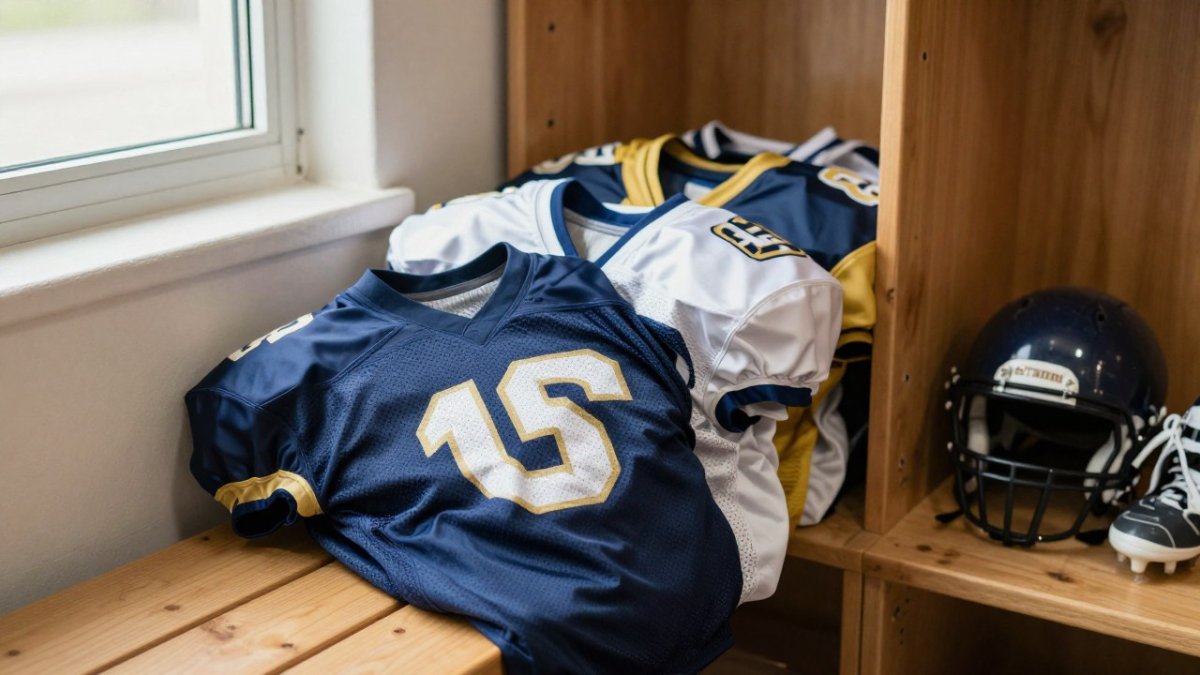
- Navy and white with a gold accent. Primary: navy (jersey body and pants). Secondary: white (numbers, lettering, side panels). Accent: gold (helmet stripe, collar trim, logo outline). Neutral: white or light gray. Navy, white, and gold can each be specified by a HEX value, and those values are a starting point for matching your logo. Navy carries authority, white keeps numbers readable, and gold adds identity without competing for attention.
- Black and white with a single bold accent. Primary: black (jersey body). Secondary: white (numbers and lettering). Accent: one saturated hue such as red near #C8102E or royal blue near #0033A0. Neutral: white or gray. The accent color carries the identity, so keep it to trim, numbers, or a helmet stripe rather than large panels.
- Maroon and cream. Primary: maroon near #7B1E3A. Secondary: cream near #F5F0E1. Accent: gold or white. Neutral: cream. Warmer than black-and-white, with a traditional, collegiate feel that reads well on matte fabric.
- Royal blue and silver. Primary: royal blue near #0033A0. Secondary: silver or light gray near #C0C0C0. Accent: white. Neutral: silver. Bright enough for broadcast, neutral enough to pair with any logo, and forgiving when embroidery thread shifts slightly from ink.
- Forest green and white with a gold trim. Primary: forest green near #014421. Secondary: white. Accent: gold near #C5B358. Neutral: white. Classic and grounded, strong for baseball and soccer where the uniform is seen against grass and dirt.
The common thread is restraint. Two strong colors plus one neutral beats four competing hues every time.
Here are the timeless palettes the article recommends, with each color’s role and starting HEX value.
| Palette | Primary | Secondary | Accent |
|---|---|---|---|
| Navy and white with gold accent | Navy | White | Gold |
| Black and white with bold accent | Black | White | Red near #C8102E or royal blue near #0033A0 |
| Maroon and cream | Maroon near #7B1E3A | Cream near #F5F0E1 | Gold or white |
| Royal blue and silver | Royal blue near #0033A0 | Silver or light gray near #C0C0C0 | White |
| Forest green and white with gold trim | Forest green near #014421 | White | Gold near #C5B358 |
Best Jersey Color Combinations Football Teams Can Wear
Football jerseys live under the harshest conditions: bright stadium lights, mud, and fast camera cuts. The best jersey color combinations football teams can wear prioritize contrast between the jersey body, the numbers, and the pants, and they account for the field surface and the broadcast camera before the first snap.
- Dark jersey, light numbers, light pants. Maximum separation between top and bottom. A navy jersey near #002147 with white numbers near #FFFFFF and white or light gray pants is the most reliable broadcast combination.
- Light jersey, dark numbers, dark pants. The inverse, equally readable. White or light gray jersey with black or navy numbers and dark pants keeps the silhouette clear at distance.
- Monochrome with a contrasting helmet. Sharp and modern, but only if numbers stay high-contrast. A black jersey with black pants needs white or light gray numbers and a helmet in a distinct hue, or the whole uniform collapses into one dark shape on camera.
- Two-tone with a neutral separator. A colored jersey and a different colored pant joined by a white or gray side panel or stripe. This is useful when a team wants two identity colors but still needs a luminance break between top and bottom.
Avoid pairing two mid-tone colors, like gray and olive, that blur together at distance. The same problem appears with red and green when they sit at similar lightness, which matters for color-vision-deficient players and spectators.
Contrast and Readability on the Field and on Broadcast
Contrast is the single most important technical decision in a football palette. Numbers must separate from the jersey body, and the jersey must separate from the pants.
A practical approach is to borrow the luminance-contrast ratio system used in the Web Content Accessibility Guidelines contrast guidance.
Field and lighting conditions change the calculation.
Test the palette at a distance before you commit. Print a small mockup, tape it to a wall, and step back twenty feet.
Finally, check opponent differentiation.
How to Use a Sports Color Palette Generator Without Losing Team Identity
A sports color palette generator is a tool that proposes color combinations based on a seed color, mood, or logo. It is genuinely useful for exploring options, but it should never make the final call.
The risk is generic output. Generators favor combinations that look good on a screen, not ones that survive screen printing or match a school’s existing branding. Use a generator to spark ideas, then filter every suggestion through three questions:
- Does it match our existing logo and school or league colors?
- Does it hold contrast between primary, secondary, and accent roles?
- Will it reproduce cleanly on the fabric and print method we are using?
A generator is a brainstorming partner, not a designer.
Accessibility, Color-Vision Deficiencies, and Practical Contrast Testing
Some players and spectators have color-vision deficiencies, which means a palette that looks distinct to a coach may look different to others. The most common confusion is between red and green, and between certain blues and purples.
The fix is simple: never rely on hue alone to separate two elements. Pair color with contrast, pattern, or a neutral. A red jersey against a green field is fine for most viewers, but if your numbers are red on a green jersey, a color-blind player may not read them.
For contrast testing, the Web Content Accessibility Guidelines contrast guidance offers a practical ratio system you can apply to jersey numbers and logos. Aim for strong luminance contrast between numbers and the jersey body, not just different hues.
Matching Uniform Colors to Logos, Fabric, and Production Limits
This is where great palettes quietly fall apart. A color that looks perfect on a monitor can shift once it hits polyester, and screen printing and embroidery each handle color differently.
A few production realities to plan around:
- Fabric shifts color. The same ink reads differently on matte and shiny fabrics, so approve a physical swatch, not a screen preview.
- Screen printing favors flat, solid colors. Fine gradients and subtle shades are hard to reproduce cleanly.
- Embroidery adds texture and slight color variation. Thread colors rarely match ink exactly, so keep accent colors simple.
- Logo files matter. A low-resolution logo will not reproduce crisply on a jersey; vector artwork is best.
If you are preparing logo files, our guide on how to prepare artwork for custom uniforms walks through the file types and resolution that print cleanly. And if you have watched colors fade on older uniforms, our breakdown of why custom team uniforms fade explains the causes and how to prevent them before you finalize fabric and color choices.
Choosing Your Team’s Palette with Piercy Sports and Apparel
Picking a palette is a design decision, but ordering it is a production decision. That is where working with a shop that handles printing and embroidery under one roof saves time and headaches.
Piercy Sports and Apparel offers high-resolution digital printing, premium embroidery, and screen printing, and the team can help you plan colors for your uniforms.
If you want to see how a full uniform program comes together, our guide on buying custom sports team uniforms lays out the steps. Budget-conscious leagues can also explore our cost-effective custom team uniform solutions for options. And when you are ready to see why teams choose us, read what sets Piercy Sports and Apparel apart.
Your palette is set, your logo is ready, and the season is coming fast. The next step is turning those colors into uniforms your team is proud to wear.
Frequently Asked Questions
What are the most popular color combinations for sports jerseys?
Navy and white, black and gold, red and white, and royal blue with silver consistently rank among the most common pairings across American team sports. These combinations work because one color carries the identity while the other provides high contrast for numbers and logos. For youth and travel leagues, navy-and-white and black-and-gold tend to be the safest starting points because they read clearly on the field and photograph well for parent and fan photos.
How does color psychology affect sports team performance?
Color psychology in sports uniforms is about perception more than magic. Red tends to read as aggressive and high-energy, blue as calm and disciplined, and black as serious and intimidating. Opponents and officials form impressions before the whistle blows, and fans attach identity to those colors. The practical takeaway is to pick colors that match how you want your team to be seen, then verify they stay readable under stadium lights and on camera.
Do certain colors improve visibility on the field?
Yes, contrast matters more than the color itself. A bright accent against a dark base, like gold numbers on navy, or white on forest green, stays legible from the sideline and on broadcast. Avoid pairing two mid-tone colors of similar value, such as maroon and navy, because they blur together at distance. Also account for the playing surface, since green turf and green jerseys reduce separation unless a white or cream outline is used.
How do I choose a unique color scheme for my team without breaking league rules?
Start with your school or program colors, then assign roles: one primary, one secondary, and one accent. Check your league’s uniform rules for home and away contrast requirements and any restrictions on opponent color clashes. A sports color palette generator can suggest fresh pairings, but test them in a contrast checker and print a physical sample before committing.