Table of Contents
- Why Thread Color Matters for Your Embroidered Logo
- Understanding Color Theory Basics for Thread Selection
- Matching Embroidery Thread to Brand Colors
- Using an Embroidery Thread Color Chart for Logo Design
- Building Effective Embroidery Color Combinations
- Selecting Embroidery Thread Colors for Dark Fabric
- Testing Your Thread Color Choices Before Production
- Common Mistakes to Avoid When Selecting Thread Colors
- Frequently Asked Questions
Last Updated: October 20, 2026
Why Thread Color Matters for Your Embroidered Logo
Your embroidery thread colors are the first thing people notice about your logo. The right choice makes your design pop. The wrong choice makes it fade into the background.
Thread color affects how your logo reads at a distance, how it holds up after washing, and whether it matches your brand identity.
Embroidery thread colors behave differently than screen or digital printing. Thread has sheen, catches light, and sits on top of fabric. A color that looks perfect on your designer’s screen might look muddy once stitched onto a jersey.
This guide covers color theory, brand matching, fabric interaction, and the practical testing you need before production.
Understanding Color Theory Basics for Thread Selection
Color theory isn’t complicated, but a few core concepts will transform how you make thread color decisions.
Certain color combinations work together naturally; others clash or feel flat. Knowing which is which helps you build palettes that feel intentional rather than accidental.
The Color Wheel and How It Applies to Embroidery
The color wheel organizes colors by hue, ranging from red through yellow, green, blue, and back to red.
For embroidery thread colors, the color wheel predicts which combinations will work. Embroidery has constraints other mediums don’t: you’re limited to available thread colors, can’t blend like paint, and work with solid thread on fabric.
The color wheel shows you three basic relationships:
Primary colors are red, yellow, and blue. Secondary colors mix two primaries: orange (red + yellow), green (yellow + blue), purple (red + blue). Tertiary colors mix a primary and secondary, like red-orange or yellow-green.
Understanding these relationships helps you avoid muddy combinations. Complementary or analogous colors read clearly; random colors compete for attention.
Complementary vs. Analogous Color Combinations
Complementary colors sit opposite each other on the color wheel: red and green, blue and orange, yellow and purple. Together they create maximum contrast, making each color look more vibrant.
For logos, complementary combinations work best for high impact: a red logo on a green jersey pops. The trade-off: they can feel aggressive without careful balance.
Analogous colors sit next to each other on the color wheel: red, red-orange, and orange. These combinations feel harmonious and coordinated rather than jarring.
For logos, analogous embroidery thread color combinations work best for sophistication: navy and light blue feels professional. The trade-off: they need strong contrast between thread and fabric to remain visible.
Test your color combinations at actual embroidery size. Colors that look good on a design mockup might blend together or separate too much once they’re stitched. The thread sheen changes how colors interact compared to flat digital colors.
Matching Embroidery Thread to Brand Colors
Your embroidery thread colors need to match your brand colors closely, or your logo loses brand recognition.
The challenge: thread comes in a limited palette and looks different than Pantone or RGB colors. Thread has texture and sheen, and sits on fabric, not on screen.
Getting Exact Color Matches with Thread Samples
Start with your brand color specification. If you only have a logo file, extract the dominant colors with a color picker tool.
The critical step: get physical thread samples. Don’t rely on online swatches, which are backlit and flat; thread is three-dimensional and catches light.
Order samples from your embroidery supplier in shades close to your brand colors: slightly darker, lighter, more saturated, and less saturated.
When samples arrive:
- Lay thread samples directly on your fabric choice
- View them in natural daylight and under indoor lighting
- Step back 10 feet and squint, does the color still read clearly?
- Compare side by side with your brand color reference
The thread that looks closest under natural light is your match, since that’s how customers will see the finished product most of the time.
Thread color shifts under different lighting. A thread that matches perfectly in your office might look completely different on a field under stadium lights. Always view samples in multiple lighting conditions before committing to production.
Accounting for Thread Sheen and Fabric Interaction
Thread sheen changes how colors appear. Polyester is shinier than cotton, rayon is shinier still, and matte thread is less common.
Shiny thread makes colors appear more saturated; matte thread makes them more muted. This matters when matching brand colors exactly.
Fabric color also affects thread appearance. The same red thread looks more vivid on white fabric and darker, less vibrant on black.
The practical approach: if your brand color is a specific Pantone, ask your embroidery supplier which thread color they recommend and why.
If your logo will be embroidered on multiple fabric colors, get samples on each. A logo that looks perfect on white might disappear on navy.
Using an Embroidery Thread Color Chart for Logo Design
An embroidery thread color chart shows available thread colors organized by hue. Most suppliers provide these, and they’re invaluable for understanding what’s actually available.
Thread color charts show hundreds of options. You don’t need to memorize them, just use them strategically.
Start with your brand colors. Find the closest matches in the chart, usually several shades of the same hue, and order samples of the top three.
The chart also helps you build supporting colors. If your primary is a specific red, it shows which blues, yellows, and greens coordinate well, and which sit opposite (complementary) or nearby (analogous).
Many suppliers organize charts by color family, making analogous colors easier to find.
Building Effective Embroidery Color Combinations
A single-color logo works. A multi-color embroidery color combination works better, if you choose the colors intentionally.
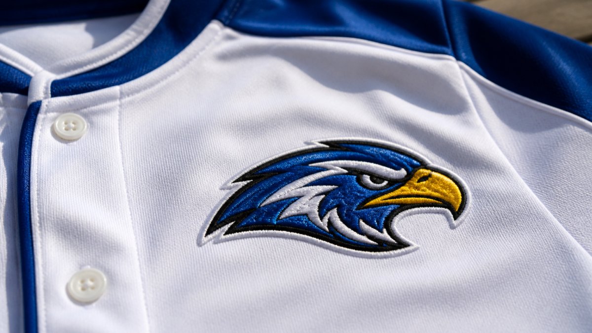
The difference between an amateur and professional logo often comes down to color choices. Professional logos limit their palette, create contrast intentionally, and work across different backgrounds.
Limiting Your Palette for Production Consistency
Every thread color you add increases complexity. More colors mean more thread changes during stitching, and more opportunities for inconsistency.
Most professional logos use two to four colors maximum, rarely more.
Why limit your palette?
First, consistency.
Second, cost. Each color change requires stopping the machine, cutting thread, threading a new color, and restarting, and that time adds up fast across dozens of garments.
Third, clarity. A logo with too many colors looks busy, and the design loses impact.
The approach: identify your dominant color and one supporting color to carry your brand identity.
Creating Contrast for Maximum Visibility
Contrast makes your logo readable. Without it, details disappear.
Contrast comes from color difference and value difference, where value is how light or dark a color is.
Bright yellow thread on white fabric has high color difference but low value difference, so the logo is nearly invisible. Navy thread on white has both, so the logo pops.
This is why single-color logos often work better than expected: solid navy thread on white creates maximum contrast and reads clearly from any distance.
With multiple embroidery thread colors, make sure each has enough contrast against the fabric.
Complementary colors automatically have good contrast since they sit opposite each other. Analogous colors require more careful selection, choosing shades noticeably different from each other.
The best embroidery thread color combinations use 2-3 colors maximum, with clear contrast between each color and the fabric. Simplicity beats complexity every time.
Selecting Embroidery Thread Colors for Dark Fabric
Dark fabric changes everything. A thread color that pops on white might disappear on navy or black.
On dark fabric, you need lighter thread colors.
The challenge: your brand colors might be dark, and navy or dark green disappears on dark fabric.
The solution: shift to a lighter shade of your brand color.
Alternatively, use a complementary color, like light yellow or gold against navy, to create contrast while still feeling intentional.
Test before production. Order thread samples in your adjusted colors, stitch them on actual dark fabric samples, and view them in natural light and under stadium lights if applicable.
Testing Your Thread Color Choices Before Production
Testing is non-negotiable. Most teams skip this step and end up with logos that don’t match their vision.
Running Sample Stitches on Your Actual Garment
Don’t test on scrap fabric. Test on the actual garment you’re ordering, since thread color looks different on a performance jersey than a cotton t-shirt, or on mesh than solid knit.
Order sample garments in the same fabric, weight, and color as your production run, and have your embroidery supplier stitch your logo using your final thread color choices.
When samples arrive, examine them:
- Does the thread color match your brand colors closely enough?
- Does the color look consistent across the entire logo?
- Does the thread catch light in a way that enhances or detracts from the design?
- Does the stitching quality meet your standards?
If anything looks off, communicate that back. Most suppliers will adjust thread colors and re-stitch samples.
Checking Readability at Small Sizes
Logos on uniforms are often small. A logo that looks perfect at 4 inches wide might be unreadable at 2 inches.
Photograph your sample garments and print the photos at the actual size your logo will appear. From 10 feet away, can you still read the logo clearly and distinguish the colors?
If details disappear or colors blend together, simplify your design. Remove small elements. Consolidate colors. The smaller your logo, the simpler it needs to be.
This is where thread color choices matter most. Too many colors becomes a muddy blob at small sizes; two or three colors with good contrast remain clear.
Take photos of your sample in multiple lighting conditions, natural daylight, indoor fluorescent, and if possible, stadium lighting. This shows you how your logo will look in real-world environments where your customers will actually see it.
Common Mistakes to Avoid When Selecting Thread Colors
Most thread color mistakes fall into a few categories. Knowing these helps you avoid them.
Mistake 2: Using too many colors. Every additional color adds complexity and cost.
Mistake 3: Ignoring fabric color interaction. A thread color that works on white might disappear on dark fabric.
Mistake 4: Not accounting for thread sheen. Shiny thread makes colors appear more vibrant; matte thread makes them more muted.
Mistake 5: Skipping the sample step. Testing takes time, but it catches color issues before you’ve committed to producing hundreds of units.
Choosing the right embroidery thread colors affects how your brand looks for years.
Frequently Asked Questions
How do you match embroidery thread colors to a logo?
Start with your brand’s official color codes (Pantone or RGB). Request thread samples from your embroidery provider that closely match those specifications. Test the samples on your actual garment fabric under natural and indoor lighting to see how the thread color interacts with the base material. Account for the fact that embroidery thread has a slight sheen that can make colors appear slightly different than on screen. Once you’ve identified the closest matches, request a sample stitch before full production to confirm readability and color accuracy.
How many thread colors should a logo embroidery design use?
Professional embroidered logos often use between 2 and 5 thread colors. Limiting your palette keeps production consistent, reduces thread changes (which speeds up stitching), and ensures the design remains clear and readable. A dominant color, a supporting color, and 1-2 accent colors typically create visual impact without overwhelming the design. More colors can introduce stitching inconsistencies across production runs and increase the risk of color mismatches between batches.
What color thread works best for small text in an embroidered logo?
For small text, choose thread colors with high contrast against your garment fabric. Black or dark navy thread on light fabrics, or white or light gray thread on dark fabrics, ensures maximum readability. Avoid pastels, metallics, or colors too similar to the base fabric, as these will blur together when stitched at small sizes. Test your thread color choice on a sample garment at the actual size your logo will be stitched to confirm legibility before committing to full production.
How do you choose thread colors that stand out on different fabrics?
Evaluate contrast first: measure the visual difference between your thread color and the fabric using a simple side-by-side comparison in both daylight and artificial light. Light thread on dark fabric and dark thread on light fabric create the strongest contrast. For mid-tone fabrics, test multiple thread options because contrast becomes harder to achieve. Consider the garment’s end use, athletic wear benefits from high-contrast combinations for durability and visibility, while formal wear may prioritize subtle, sophisticated color coordination. Always request sample stitches before production.