Table of Contents
- Start With Your Brand Identity and Color Palette
- How to Match Logo Colors to Apparel Without Losing Impact
- Color Psychology by Industry: What Your Polo Color Says Before You Speak
- Best Colors for Company Polo Shirts (And When to Break the Rules)
- Fabric, Printing, and Embroidery: Where Color Choices Meet Reality
- Custom Business Apparel for Staff: Building a Cohesive Wardrobe
- Color Accessibility, Maintenance, and Seasonal Trends
- Frequently Asked Questions
Last Updated: September 16, 2026
Start With Your Brand Identity and Color Palette
Choosing professional colors for company polos starts with your existing brand identity, not a trend chart. Pull your official palette first, then decide which one or two colors carry the shirt. This guide covers the full process, from hex codes to embroidery thread.
Your brand guidelines usually list primary and secondary colors with hex codes and Pantone references. Those codes are the source of truth: if a supplier can’t match them, the shirt looks like a close approximation, not your company.
A common mistake is treating every brand color as equally wearable. Bright accents that pop on a website often overwhelm a garment, so most programs work best with one dominant color and one accent.
- Primary color: the shirt body, usually a neutral or deep brand tone
- Secondary color: the logo, trim, or collar detail
- Accent color: reserved for small touches, never a full panel
Ask for a physical swatch before you commit to a run. Screen colors shift between monitors, and a navy that looks rich on a laptop can read almost black on cotton.
How to Match Logo Colors to Apparel Without Losing Impact
The rule for matching logo colors to apparel is simple: protect contrast, not color fidelity. A logo that disappears into the fabric fails no matter how accurate the Pantone match is.
Place your logo on candidate shirt colors and view them from a few feet away; details that read clearly up close often vanish at conversation distance.
Check Contrast Before You Commit
Contrast is what makes a logo legible. Compare the relative lightness of your logo color against the shirt color: a dark logo on a light shirt, or a light logo on a dark shirt, always outperforms two similar tones.
Skipping the contrast check is the most common reason a finished polo run looks muddy. Once the shirts are printed, there is no fixing it without a reorder.
Color Psychology by Industry: What Your Polo Color Says Before You Speak
Color psychology in business studies how hues shape perception of a brand before anyone reads a word. The associations aren’t universal but are consistent enough to guide a decision, and the useful version is a set of trade-offs by sector: the same navy that signals stability in banking can read as staid in a design studio.
Finance, Law, and Professional Services
Navy, charcoal, and deep burgundy dominate because they signal steadiness and discretion. The trade-off is differentiation: a room full of navy polos is invisible. Firms that want to stand out often keep the navy base and shift the logo thread to a warmer accent, or move to a deep green that reads conservative but less common.
Healthcare and Wellness
Soft blues, teals, and clean whites project calm and hygiene, but white and pale blue show every spill. Many healthcare programs use a mid-tone teal or slate blue that reads clean but hides wear. Avoid reds and oranges near patient-facing staff, they can read as alarm rather than care.
Trades, Logistics, and Field Services
High-visibility colors and durable darks dominate for safety and dirt. If your team works near traffic or heavy equipment, the polo color may be governed by high-visibility requirements rather than brand preference, so check those rules first. For non-regulated field work, charcoal and heather gray hide dust and grease better than navy.
Tech and Creative
Bolder accents, blacks, and modern grays signal innovation without a suit’s formality, but trendy accents date quickly and rarely match on reorder. A common pattern is a black or charcoal base with one saturated accent in the logo or collar detail, keeping the shirt current without tying the program to a passing trend.
Hospitality and Retail
Warm neutrals and earth tones dominate because they feel approachable rather than institutional. The constraint is contrast against the environment: a beige polo disappears against a beige lobby, so hospitality programs often add a deep brand color in the logo or trim. Avoid heavy darks in warm climates, they absorb heat and read as less welcoming.
How to Apply This Without Guessing
Most generic guides stop at industry color psychology, and get vague there. The useful version is narrower: pick the association you want to project, then choose a color that carries it. Write down the one word you want a customer to feel, steady, calm, capable, modern, welcoming, and test candidates against it. If a color doesn’t reinforce the word, it’s decoration, not strategy.
Run a five-second test: show a photo of the polo to someone outside your company and ask what industry they think it belongs to. If the answer is wrong, the color is sending the wrong signal before anyone speaks.
Best Colors for Company Polo Shirts (And When to Break the Rules)
The best colors for company polos are navy, black, charcoal, white, and heather gray, because they pair with almost any logo and hold up across repeated wear, forming a dependable base for most corporate apparel programs.
Here is how the common choices compare:
| Shirt Color | Best For | Watch Out For |
|---|---|---|
| Navy | Corporate, finance, everyday uniform | Can look heavy in summer |
| Black | Modern brands, hospitality, events | Shows lint and fading |
| White | Healthcare, warm climates, clean look | Shows stains quickly |
| Heather gray | Casual teams, retail, mixed groups | Low contrast with gray logos |
| Bold accent | Events, spirit wear, campaigns | Harder to match year to year |
Fabric, Printing, and Embroidery: Where Color Choices Meet Reality
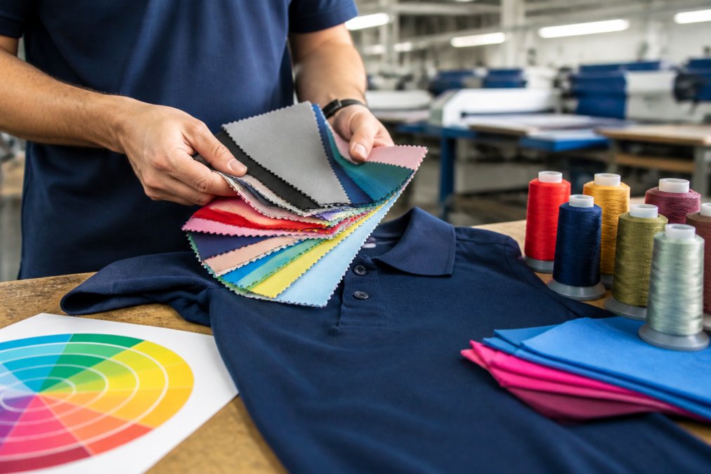
A color that looks perfect on a swatch can behave differently once it lands on fabric and goes through printing or embroidery. The gap most guides leave open is the mechanism: why the same Pantone number produces different results on cotton versus polyester, and why printed and embroidered logos of the same color rarely match exactly.
How Fabric Type Changes the Color You See
Fabric type changes how a color reads. Cotton absorbs dye deeply for a matte, saturated finish, while polyester blends look slightly brighter and shift hue under different lighting because synthetic fiber reflects light differently. A 100% cotton navy and a 60/40 cotton-poly navy won’t match under fluorescent light, even dyed to the same reference.
Printing and Embroidery Handle Color Differently
Screen printing lays down flat, opaque ink that holds bold color well and stays consistent across a run. For a one- or two-color logo, it’s usually a color-accurate and durable option.
Pantone Matching and Why It Matters for Consistency
Pantone matching aligns your brand colors to a standardized reference so every order comes out the same. Without it, a navy polo ordered in spring and reordered in fall can arrive looking like two different colors.
A photo of your logo is not a color reference. Screens, cameras, and lighting all shift color, so a supplier working from a photo is guessing. Always supply the Pantone number and, when possible, a physical thread or ink swatch for approval.
Maintenance and Color Longevity
How a polo is washed decides how long its color lasts. Dark saturated colors fade with washing and sun exposure, while light colors show stains. Cold water, inside-out washing, and air drying extend color life; chlorine bleach and hot dryers accelerate fading, and industrial laundering with high heat and strong detergents shortens it faster than home washing.
Consistency comes from a shared reference, not a shared opinion. Pantone numbers turn “make it navy” into a repeatable instruction, and matching fabric content keeps that instruction from drifting.
Custom Business Apparel for Staff: Building a Cohesive Wardrobe
Custom business apparel for staff works best as a small, disciplined system rather than a one-off order. Define a base color, logo treatment, and decoration method, then apply them across every garment your team wears.
- Fix one base shirt color for daily wear
- Keep logo placement identical across garments
- Standardize on one or two decoration methods
- Order a small buffer for new hires and replacements
Color Accessibility, Maintenance, and Seasonal Trends
Color accessibility means choosing combinations that stay readable for people with color vision differences, not just the majority. Most guides skip it, yet it affects whether your logo is actually seen.
- Check contrast, not just color, for accessibility
- Wash cold and inside-out to protect color fastness
- Treat trendy shades as accents, not uniforms
- Reorder against your Pantone reference, not a photo
Frequently Asked Questions
What are the most professional colors for company branded polos?
Navy, black, charcoal, and white are the safest professional choices for company polos. Navy projects reliability and works across industries from finance to trades. Black and charcoal offer high contrast for logos and hide stains well. White looks crisp but shows wear faster. For a less formal but still professional look, consider heather gray, forest green, or burgundy. The right choice depends on your logo colors, industry, and how often staff wear the polos.
Should I choose light or dark colored polos for my staff?
Dark polos hide stains and hold up better for daily wear, which is why navy, black, and charcoal are common in uniforms. Light polos like white or light gray look sharp in indoor, client-facing settings but show spills and yellowing over time. For outdoor or physical work, dark colors are more practical. If your logo has dark elements, a light polo provides better contrast. Many companies order both: dark for everyday and light for events.
How do I match logo colors to apparel without the logo getting lost?
Start by checking contrast between your logo colors and the polo fabric. If your logo is navy, a navy polo will swallow it. Use a contrasting thread or a lighter or darker shirt. Pull the exact color values from your brand guidelines, then request fabric swatches and a stitch-out or print sample before ordering. For embroidery, thread colors can shift slightly from screen colors, so always approve a physical sample. This prevents costly reorders and keeps your brand consistent.
What is the 3-color rule for professional attire?
The 3-color rule suggests limiting an outfit to three main colors: one dominant, one secondary, and one accent. For company polos, this means the shirt color, the logo color, and any trim or accent should form a simple, balanced palette. Sticking to three colors keeps the look clean and professional. It also makes it easier to coordinate across a team, since everyone wears the same palette. If your brand has more colors, use the two strongest for the polo and logo, and reserve the rest for other materials.